Perhaps the most controversial subject in applied psychology is color psychology.
Use red buttons, and your clicks will double. Use the wrong color, and people will hate your brand.
With a history of bad science and absurd claims, many can’t tell whether color psychology is legitimate or nonsense.
In this article, I’ll explain why color psychology got discredited, why pseudoscience dominates the conversation, and why you need to give it a second chance.
Here’s why it matters: color psychology helps you design for the human brain and build better digital products and campaigns.
On its own, color psychology is useless. Think of it as a catalyst.
Use color strategically, and you’ll make good products great. But misapply it, and you risk sabotaging your products.
Consider these common behavioral design blunders:
- Drawing the wrong level of attention to a message
- Evoking the wrong cognitive associations
- Evoking counterproductive emotions
- Sending contradictory behavioral triggers
Also consider the legal and ethical risks, like failing to make risks salient or deploying nudges that qualify as deception.
My favorite color blunder comes from New York, where the misapplication of red changed how citizens voted in an election.
Think about it:
- How influential are nudges that people don’t see?
- How effective are subliminal techniques that users notice?
- How legal are default opt-ins that color-blind people misinterpret?
Color psychology helps you grab people’s attention, create instant comprehension, boost emotional reactions, nudge decisions, and guide behavior.
Pseudoscience authors tell you that hooking and addicting users is easy. Actual science says the opposite.
The effects of color are small, but they add up.
In the real world, we build behavior-change products from core motivators. We use psychological models to guide design and add every incremental advantage we can get. The psychology of color helps at every step. Applied well, it makes good interventions great. Misapplied, it can sabotage your work.
Here are three explanations for why “color psychology” became such a dirty word.
1. Color psychology has a genuine track record of contradictions
The first barrier is that color psychology is a controversial scientific topic, full of contradictions.
Scientists still publish papers on whether pink prisons relax inmates. One study shows it works; another shows it doesn’t, and the contradiction cycle continues.
Many scientists are also skeptical of early color psychology research, finding it lower quality by today’s standards.
But things are different today.
Research on the neuroscience of color now gives a biological explanation for the older ethnographic studies on human color perception. The neuroscience of color helps us understand some of the classic psychological trends too.
I never understood why depressed people are more likely to use grey filters on Instagram, why they lose their ability to contrast grey tones when depressed, and why people complain that grey skies are depressing. Newer color psychology theories are finally attempting to explain what’s going on.
You probably don’t know it, but we humans read other people’s facial colors just as much as their body language. We use color to judge people’s feelings, honesty, sexual interest, health, intentions, and more.
Blushing while apologizing makes you look more sincere. But not turning red makes people think you’re lying, because there’s no physiological sign of guilt. Turning red in a potentially violent situation has another meaning. In a health context, yet another. In a romantic context, yet another.
Rather than contradictory, the new view is that color associations are context-specific.
When you process images based on the four primary colors (yes, four, not three) by aligning them in the opponent color channels our eyes process before sending signals to our visual cortex, you can extract color patterns in the human face that express emotion and physiological signals.
Put another way: AI algorithms, inspired by the human nervous system, can read our emotions and health at shockingly high levels. And this is replicating across research groups.
We’re well past those pink prison debates.
But this new wave of color science brings some troubling possibilities too.
Nobody’s cracked mind-reading algorithms yet. But I’ll bet that human facial color algorithms, combined with temporal processing, will bring us the closest thing to mind-reading technology we’ve seen. Once these color-based emotion and health-reading algorithms mature, Thinkpol, George Orwell’s Thought Police, may be ready to open its doors.
At the same time, telehealth may go through a revolution where simple cameras and color processing monitor your health and predict risks without expensive sensors.
Rather than a fluffy topic, color psychology and technology is a critical area that could transform how we build digital products.
The old contradictory science may have scared many off. But the new science is fascinating, with discoveries that are starting to look consistent.
2. Color science is too technical for most designers to access
The second barrier is that color psychology is highly technical.
Those who think color psychology is a touchy-feely subject are off base. It’s deeply tied to the hardest of hard science.
You’ll find many graphic design strategies that only make sense from the perspective of human health, biology, the neuroscience of visual processing, the neurobiology of emotion, sexual selection, and more.
Worse, you can’t penetrate the science unless you learn several color systems.
Color researchers use mathematical representations of color called color spaces, color models, or mathematical transformations of those spaces.
You may know CIE XYZ. It’s the global standard of perceptually uniform color spaces. In other words, CIE XYZ is a mathematical system that represents how humans perceive color.
If you’ve felt dazzled by the beauty of data visualization packages like D3, here’s a trade secret: those visualizations are intuitive and beautiful because they’re built from perceptually uniform color systems like CIE Lab, CIE Luv, and others.
Some in the W3C are lobbying to make CIE Lab a global CSS standard. If you have any political connections, support this cause. Now’s the time to drop sRGB.
Color psychology insights are fragmented across numerous disciplines, usually in technical jargon and complex math. That barrier keeps most designers from ever getting started.
3. Color pseudoscience drowned out the actual science
Search for “color psychology” and you’ll quickly land in a world of made-up pseudoscientific nonsense.
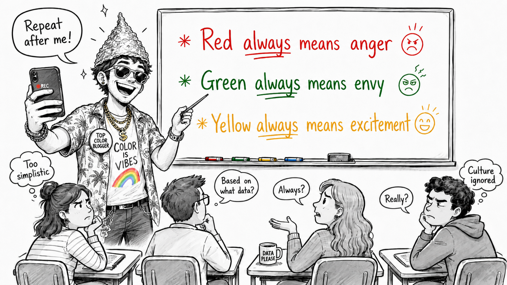
Red boosts conversion rates by 30%. Green makes users envious. Pink prisons make inmates feel relaxed, so pink apps should work the same.
These are your standard color psychology claims: too good to be true and occasionally backed by “science.”
Whenever scientists can’t offer simple guidance on a topic, gurus fill the gap. And online, the gurus won.
In my experience, gurus usually cherry-pick studies that validate their views. Hard-working researchers do the opposite: they read broadly before drawing conclusions.
It’s often the confident fools who drive the spread of disinformation, while the uncertain stay silent, waiting for better evidence.
This partially explains why the web is full of misinformation on color and the brain.
Online, you can find sources arguing that red buttons can boost conversion rates by over 30%. Is this a believable impact metric?
Years back, a synthesis study showed that the average government behavior change program got 5% of people to live healthier lives. Soon after, I published a statistical meta-analysis showing that health behavior change websites made a 10% impact. Generally, e-commerce hovers around 2–3% conversion rates.
Credible impact metrics are often below 10%. So how can red buttons boost conversion by over 30%?
Depending on how you calculate conversions, a 1% boost is sometimes a 50% or 100% boost. Big impacts often have more to do with deceptive math than psychology. I usually distrust industry numbers.
Another common distortion is overgeneralizing: taking a trivial, low-effort, short-term behavior and suggesting the same applies to profound, high-effort, long-term behaviors. Signing up for a newsletter is not the same as quitting smoking. Be wary of gurus who overgeneralize.
Many people still believe that red buttons convert better than other colors. Red may be the most researched color, but I haven’t found any scientific consensus that shows it performs better. Conversion specialists usually argue the effect is about contrast ratios, not color categories.
Shilling nonsense color psychology has proven to be a winning SEO formula. And so I’ll point the finger of shame at Google for rewarding propagators of misinformation.
A web full of questionable content makes it easy to understand why people feel confused and avoid the subject.
Final thoughts
Color psychology is not a fluffy subject. It’s tied to hard science, with a new wave of research producing consistent, fascinating discoveries. In applied UX and behavioral design, there are some important lessons that can help us to take our craft to the next level.