
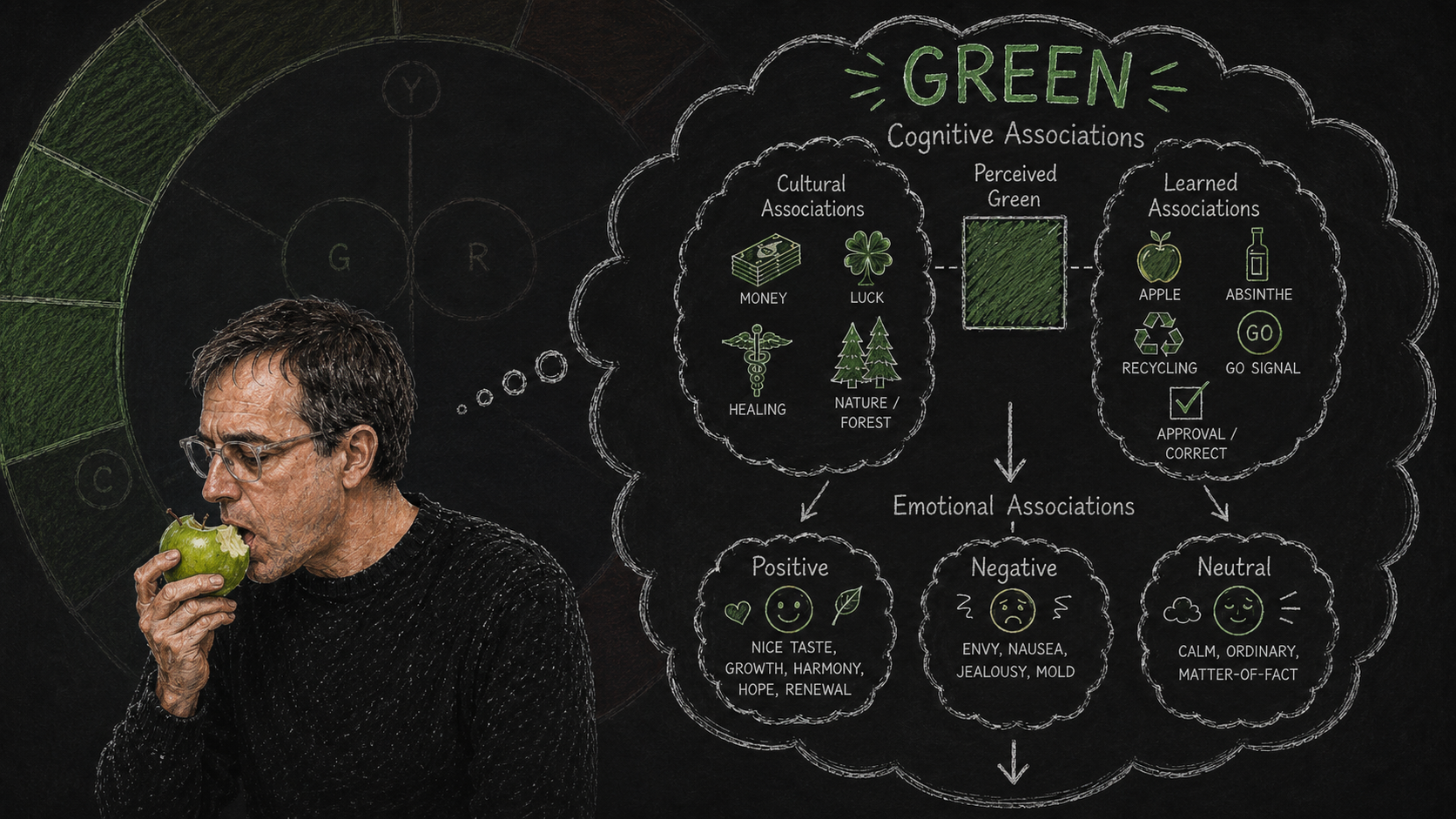
When people talk about the “meaning” of color, they’re usually asking a cognitive psychology question — not an emotional one. What concepts, people, places, things, or ideas do we associate with a given color? What category does our brain reach for first when we see red, or green, or purple?
This is distinct from emotional associations, which are covered separately. The meaning of color, as a topic, belongs to cognitive psychology — the study of how we form concepts and categories, and how those concepts shape perception and behavior.
Humans are pathological classifiers. Categories shape how we perceive the world. We think in categories. Categories trigger our emotional reactions. The more we learn in life, the more we create new categories that transform our world view.
So how did we reach the point where certain colors come with categories? Why do some people claim that green means envy, or red means passion? The whole debate on the meaning of colors is actually a debate on cognitive associations — in other words, what’s the first category that comes to mind when you look at any color? And critically, that answer varies by culture, context, and lived experience.
Cultural Color Perception
People who speak different languages often refer to different wavelengths when they describe similar colors. In English, we use the word “red” to describe roughly 650–700 nanometers on the visible light spectrum. Another culture may apply their equivalent of “red” to 625–700 nanometers — which an English speaker would call red-orange.
Depending on where a culture defines its color wavelength ranges, this affects speakers’ memory, ability to learn, and ability to contrast different colors. The more you use colors that are central to a culture’s color vocabulary, the easier it will be for people from that culture to process and remember your colors. Colors near the boundary of their cut-off points are harder to distinguish and less memorable.
This explains the underlying differences in color palettes that vary from culture to culture — and why cultural sensitivity matters in any international or cross-cultural design work.
Learned Associations
Color associations are not hardwired. They’re learned — built up through repeated exposure, reinforcement, and emotionally significant events.
Imagine a society where on TV, the villains wear green uniforms and the heroes wear red. After fifteen years of green baddies and red-shirted goodies, the culture may start to develop a co-association between green and bad, red and good. That’s a mild example. The associations become far stronger when the emotional stakes are higher — we form deeper memories from events with stronger emotional valence. We remember the best and worst moments of life far more than the routine ones.
So if a criminal gang rolls into town wearing green, the color may become co-associated with intense dislike. But if it’s a violent green-shirted militia committing atrocities, then green can burn into citizens’ long-term memory as an extreme anxiety trigger. Same color, very different cognitive and emotional weight — depending entirely on the history of the people perceiving it.
We call the process of associating anything with a reward or punishment reinforcement learning. A color associated with punishments will eventually evoke a threat response; a color associated with rewards will start to evoke an opportunity response. This is one of the core mechanisms behind branding psychology.
Another way of explaining this is through associative memory networks. When you look at an image dominated by green, those colors trigger millions of memory circuits with related concepts, emotions, and sensory experiences. While your brain works to classify what it’s seeing, it simultaneously activates emotional responses based on past associations. The net effect is that some level of cognitive and emotional response is triggered — often below conscious awareness.
The critical point is that these associations are individual, group, and culturally specific. Claims about universal color meanings should always be treated with skepticism. If there’s any merit to a particular color-meaning claim, it likely applies only to a certain population over a certain period of time. When it matters, test your color choices with members of your actual target audience.
Applying Emotional Associations
How do we use color to evoke the right emotional tone? Start with a theoretical example: imagine a culture where purple is associated with high status and grey with low status. Rub some of that high-status purple on your logo and you’ve instantly created a brand with elevated connotations. Apply that low-status grey to a political opponent’s campaign materials, and you’ve built something considerably more sinister.
Color co-associations also shift over time, which is why colors come in and go out of fashion. Trend-sensitive colors can signal in-group membership powerfully — but the value fades quickly as the trend moves on. If you want designs with a longer shelf life, neutral colors and whites tend to age better than anything chasing the moment.
Applying Cognitive Associations
Beyond emotional tone, color carries cognitive associations — intellectual meanings that help users understand how to use a system. This is where meaning of color becomes directly practical for interface design.
When building navigational systems, I use color to train users on how to interact with an interface. Color-A signals outcome-A. Color-B conveys information-B. Color-X marks the most important task; color-Y is secondary. Done consistently, color becomes a silent instruction system that reduces cognitive load.
There are very few universal color-emotion associations. But there is one near-universal cognitive one: traffic light colors. Thanks to the Vienna Convention on Road Signs and Signals, most of humanity shares the same color-to-meaning mapping — red means stop, amber means prepare, green means go. If your interface can leverage those pre-existing associations, do it. It’s always easier to build on what people already know than to teach them something new from scratch.
But be wary of mixed color metaphors. The moment the same color carries two different meanings within the same system, you’ve created confusion — and confusion in interfaces has a cost. Every ambiguous color signal is a small tax on your users’ attention and trust.