
To some degree, the arts are fields where the key measure of success is creating something that is pleasing to people’s senses. Musicians combine sounds to please our ears; master chefs combine foods to please our taste; while artists combine shape and color to satisfy our eyes.
But the arts often go beyond pleasing the senses: provoking thought, entertaining, or evoking sensory dissonance like overloading people’s sensory systems, or minimalism like underwhelming people’s systems. Color works the same way. You can use it to create harmony, or you can use it to create friction. Both are legitimate tools, depending on what you’re trying to achieve.
At its most fundamental level, color is an emotional design tool. Calm and stress are the most primitive emotions humans experience, which makes this the most basic emotional design decision you’ll make: how much tension do you want your users to feel?
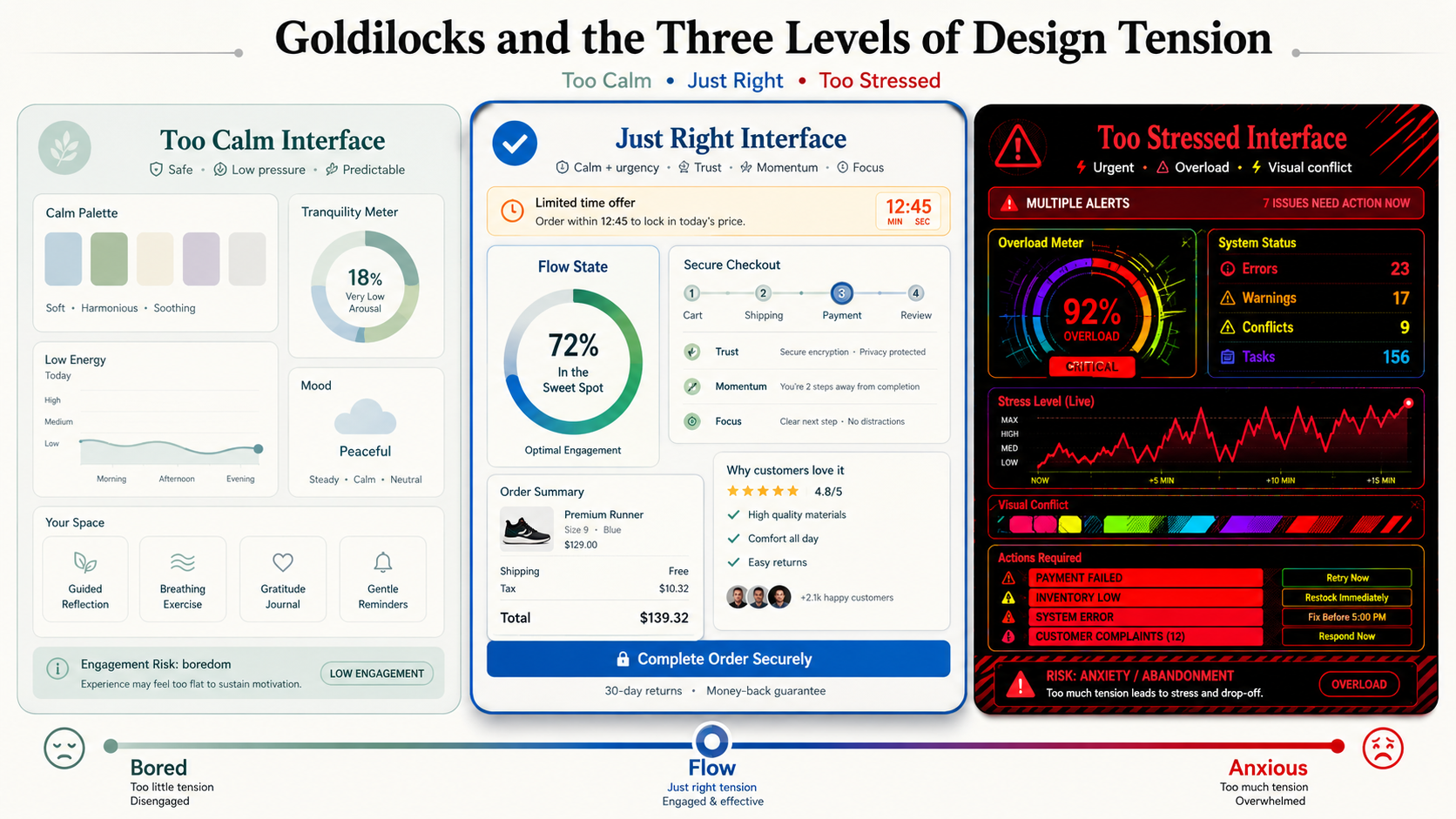
Goldilocks and the three levels of design tension
The right amount of tension depends entirely on what your product needs to do. Think of it as a spectrum with three positions.
Too calm
A meditation app, a CBT tool, or a self-reflection platform needs to strip away every possible source of visual stress. The goal is to lower arousal and help users feel safe enough to engage honestly with difficult emotional material. That said, according to Mihaly Csikszentmihalyi’s flow theory, the backfire risk here is that if there’s no stress at all and no pressure on people, they may feel bored and fully disengaged. In that case, you’ll need to add a little pressure — not too much, just enough to keep people engaged.
Too stressed
A high-pressure adventure game, an emergency response interface, or any product that forces users to make critical decisions under risk needs to signal urgency at every turn. Visual tension keeps users alert and primes fast action. But according to flow theory, if we overdo the pressure, we risk causing so much anxiety that users disengage entirely. So even in high-stress environments, you need some level of calming, confidence-building design — just not so much that you undermine the urgency the product depends on.
Just right
A checkout flow is a good example of the middle ground. You want users to feel calm, safe, and trusting — that converts. But a limited-time offer adds a layer of productive pressure. Too much stress and they abandon the cart. Too little and they drift off to think about it. According to flow theory, when we hold people in that space between calmness and pressure, we’re holding them in what Csikszentmihalyi would call a flow state: fully engaged, neither bored nor anxious. That’s often the ultimate design goal, not just in games but across software design more broadly.
Both extremes have their place. Some products should lean heavily calm; others should lean heavily stressed. But neither should cross the line where you lose users to boredom on one end or anxiety on the other. Most of the time, you’ll be building products that use a combination of both, calibrated to the context.
There are many techniques for achieving this balance. Color palette is one of the more prominent ones, and it’s what the rest of this article covers.
Calm color schemes
The research on aesthetically pleasing colors deals more with related colors: contrasting colors or similar colors. So a good starting point for establishing pleasurable color combinations is the color wheel, which is typically used for this exact purpose.
The figure below shows color combinations based on the color wheel, which you can use to guide your palette selection toward colors that work together, aid contrast, and generally feel comfortable on the eyes.

Figure: Color combinations
There are so many books, articles, and palette generators covering how to combine colors that there’s no point in retreading that ground here. Think of palette generators as tools for producing harmonious combinations, but not necessarily functional ones. Harmony and function are different problems.
Stressed color schemes
While some color combinations feel easy on the eyes, others feel strained. Perhaps the best-known way to strain users’ eyes is an effect called chromostereopsis. This is the wobbly optical illusion that people experience when they look at two colors that are far apart on the color spectrum.
Red and green appear close together on the color wheel and, according to color theory, should be nice complementary colors. But on the color spectrum, they’re quite far apart, and that distance is what causes the problem.
Chromostereopsis emerges when one color reaches the eye slightly faster than the other, due to different wavelengths. This creates an optical illusion where one color appears closer than the other.
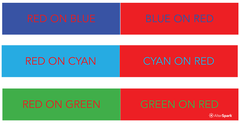
Figure: Chromostereopsis

Figure: Chromostereopsis on the color spectrum
I’m not into creative dogma, such as “thou shalt not do X.” I disagree with those who preach that chromostereopsis needs to be hunted down and destroyed. Instead, I advocate understanding it and deciding whether to use it based on whether it advances or undermines your design goals.
When I want to achieve a pleasing design effect, I try to eliminate anything that even feels like chromostereopsis. However, I’ve used it intentionally in the past: to attract attention, as a parody of lousy design, and as a technique to create an edgy feel. Others prefer to avoid it at all costs, and that’s a defensible position too.
As I see it: if it helps you achieve a goal, use it. If it undermines that goal, avoid it. The effect isn’t good or bad. It’s a tool. And like any tool, what matters is whether you’re reaching for it intentionally or stumbling into it by accident.
Color as emotional design
We’ve covered three levels of design tension and two color techniques for shifting users toward calm or stress. Neither technique is a universal solution — you’ll need to adapt your color palette to the level of tension that fits the product you’re building.
Because calm and stress are the most fundamental human emotions, the stress response is why tension is such an important element in design. It sets the broader emotional context in which most products operate. A little tension keeps people engaged and motivated. Calming techniques keep them feeling confident and in control. Striking the right balance between the two is, in many ways, the core goal of emotional design.
These are just a couple of color techniques, but they’re a solid place to start. If you put them into practice, I’d love to hear how it goes.
References
- Csikszentmihalyi, M., Abuhamdeh, S., & Nakamura, J. (2014). Flow. In Flow and the foundations of positive psychology: The collected works of Mihaly Csikszentmihalyi (pp. 227-238). Dordrecht: Springer Netherlands.