Color Psychology for Behavioral & UX Design (CBX)
Learn how color shapes perception, emotion, and behavior in your digital products and campaigns.
We will protect your privacy
Join our students from beginners to pros in top companies:


Build better technology with color psychology
You'll learn how to use the psychology and neuroscience of color in your digital products and campaigns.
We start with the physics and biology of color perception, then connect this to behavioral science and emotional design.
Through practical examples, you'll explore how color supports accessibility, user attention, comprehension, emotion, and branding. We also examine color systems and the constraints of working with digital technology.
The course is designed for beginners, experienced designers, and alumni from our other training.
Lessons
Here's what we'll cover. These nine lessons connect color science with the decisions you make when designing digital products and campaigns.
Lesson 1: Light, color & vision
This lesson starts with a conceptual review of light, color, and the electromagnetic spectrum. Next, we'll discuss the human eye, color perception, visual impairments, and how the brain processes color. Finally, you'll learn how our biology, culture, and language bias the colors we notice and those we ignore.
Lesson 2: Color systems & technology
This lesson explains how different color systems work and what they mean for digital design. We'll compare sRGB and perception-based color spaces such as CIELAB, then cover color standards and metrics. You'll learn how your choice of color system affects aesthetics, accessibility, and how easily users interpret colors. We'll also introduce the behavioral color system and related design resources.
Lesson 3: Behavioral design & color psychology
We'll set goals for your color palette by exploring the demands placed on a color system. Then we'll take a behavioral science approach to color, emotion, and judgment. You'll learn to examine the research behind color associations and consider how context affects the way your users interpret a color.
Lesson 4: Light cycles & circadian health
This lesson explains how seasonal and daily cycles of light shape users' color preferences, emotions, and physical health. You'll gain a new perspective on color temperature and the ways colors fluctuate all around us. We cover circadian rhythms and strategies for building technologies that are more engaging, less disruptive, and better at promoting user health. We cover other visual health topics then go over techniques for building healthier and more engaging technologies.
Lesson 5: Controlling attention
When users don't notice important content, problems happen. Our tech becomes hard to navigate, motivating messages don't motivate, and users make mistakes. In this lesson, you'll learn how to control the salience of every visual component so users notice the parts that matter. You'll then learn to translate these strategies into a visual hierarchy that keeps your system usable, motivating, and enjoyable. What's better, your tech will feel super intuitive.
Lesson 6: Instant comprehension
When designers misapply color, users feel confused, lost, and sometimes so frustrated that they leave. Miscolored charts can cause users to misjudge what numbers mean. Badly colored messages can lead users to make harmful mistakes or miss opportunities they'll regret. This lesson covers how people ascribe meaning to color, multi-sensory perception, perceptual uniformity, and symbolic understanding. We'll go over applications for UI and data visualization.
Lesson 7: Motivating emotions
Nothing happens in technology till users feel something. But what colors evoke the right emotions? This lesson covers neuroaesthetics, how we form emotional associations with color, and techniques for motivating and reinforcing user behavior. We cover Dr. Cugelman's motivational quadrant system and show you how to use the Color Psychology Map in emotional design. We also cover research techniques for uncovering emotion-color associations.
Lesson 8: Conscious behavior
There are times when we want our users to form routine habits with our interfaces. But at other times, we need them to stop, think, and make a conscious decision. In this lesson, we go over design strategies for different levels of consciousness, focusing on forming color-behavior associations that support unconscious, habitual behavior. We also cover techniques for stopping the flow and forcing users to stop and pay attention.
Lesson 9: Trustworthy brands
You'll explore how to make your brand colors work alongside the functional colors in your interface. We cover familiarity, trust, and the problems that arise when brand colors compete with usability. You'll learn practical strategies for a color palette that supports both your brand and your users' needs.
Learn by seeing the psychology of color
Color psychology is easier to understand when you can see it. We use images and visual maps to connect research with design choices.
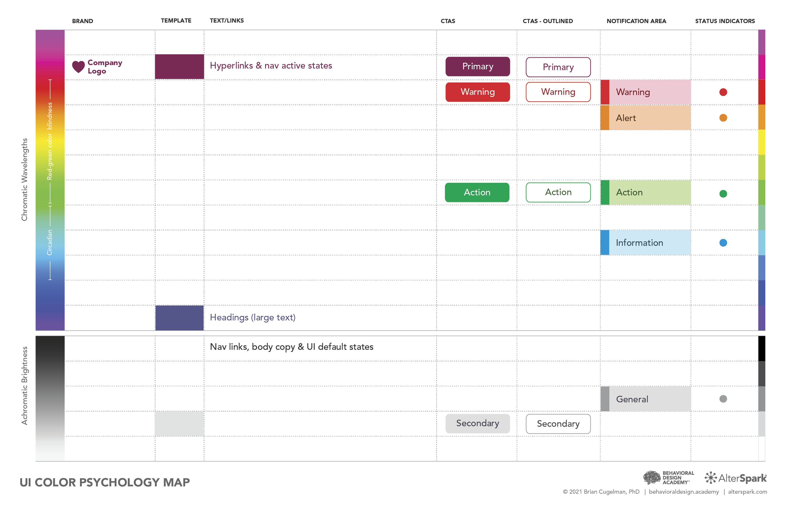
You'll explore how changes in color affect an image's meaning, then use the UI Color Psychology Map to relate those insights to your own work.
Connect color research to design decisions
Color research can be difficult to translate into everyday design work. We explain the ideas in plain language and show you what they look like.
You'll explore perception, color associations, and emotional responses. We'll also look at the limits of the evidence, so you can distinguish a useful finding from a claim that needs more support.
We use visual design resources to connect color with perception, cognition, and emotion. You'll explore the behavioral color system and use the Color Psychology Map to compare color choices for different design goals.


Work through practical color challenges
Your color palette has several jobs. It needs to help users understand your interface, notice what matters, and recognize your brand.
We use design challenges to explore how these demands work together. You'll connect lessons about accessibility, health, comprehension, and emotion to concrete decisions about color.
The UI Color Psychology Map helps you compare those decisions visually and explain the thinking behind your palette.
Color design resources
You'll explore visual maps, design guides, and interactive tools that help you apply color research to your work.
- Interactive design tools
- Color research methods
- Design guides
- The UI Color Psychology Map
Color psychology for digital design
You'll work through applications such as:
- Web and mobile interfaces
- Digital communications and campaigns
- Data visualization
- Visual hierarchy, accessibility, and emotional design
- Color palettes for prototypes and design systems
Join thousands who’ve completed our training
From beginners to pros in top companies