Colors and Emotions
When it comes to emotional design, there’s a lot of talk about happiness-evoking tech. This is a nice idea in theory, but if your goal is to shape your users’ behaviors, you’ll need to target a broad emotional spectrum.
In this section, I’m going to discuss some introductory topics in emotional design, and then show you how color can contribute to our technology’s emotional canvas.
Three dimensions of emotion
Let me start by clarifying the difference between an emotion and a feeling. An emotion is a complex set of physiological changes in response to a perceived threat or opportunity. They’re automatic and mostly unconscious, which is why we’re never fully aware of all the changes we’re experiencing. A feeling is our awareness of that emotion.
There are two scientific schools of thought on emotion. The first is the “basic emotions” school. Its followers argue there are six or more basic emotions that are universal across cultures. This idea comes from Darwin, it’s the “traditional” track in emotion research.
The second academic approach is the “dimensional emotions” school. Its followers argue that emotions are constructed through complex neurological processes that can be characterized by three dimensions: arousal, pleasure and control. Neuroscientists are closer to this approach, and it’s the approach I use too.
In the dimensional approach, every emotion either boosts or lowers these three dimensions: (1) arousal, (2) pleasure, and (3) control. I think of them as the loudest signals that we feel. I think of them as the loudest signals that we feel.
Here’s a description of each:
Arousal
Arousal is the level of physical and cognitive energy experienced. When someone’s arousal is cranked-up, they’ll feel energized, focused, and experience a strong sense of cognitive and physical energy. When turned down, they’ll feel more lethargic and unfocused. Physiologically, we talk about nervous system activation for arousal, and in strong emotions, activation of the stress response.
Pleasure
The pleasure dimension describes how pleasurable or painful emotions feel. This is also called valence, or emotional valence. You can divide most emotion into two categories: those that feel good and those that feel bad. There are also complex emotions that evoke both good and bad feelings at once, like nostalgia.
Control
Control describes how much power someone feels that they hold in any situation and whether they feel dominant or submissive in any given social hierarchy. When people possess more power or control, they generally feel calmer and more confident. With less power and control, people can’t fully predict the outcome of a situation, which can lead them to feel higher levels of stress.
Four emotional quadrants
Now I’ll show you how the three emotional domains combine into four emotional quadrants, that I use as the basis for emotional design strategies. Figure 10 shows a simplification of the Cugelman emotion map.

Figure 10. Simplified Cugelman emotion map
There’s a lot of research behind this map. However, what you need to know is this:
- The four quadrants in my emotion map incorporate the three primary emotions, plus the stress response
- I use this model for both motivational and learning applications. Typically, people confuse these two distinct applications. In this book, I’ll primarily discuss motivation.
- Later when I show you how color relates to the three dominant emotions, I’ll take the discussion back to the quadrants.
Optimistic: High-arousal, pleasurable emotions
This quadrant of highly-arousing and pleasurable emotions is where we feel control, motivation and pleasure. They include feelings like curiosity, excitement, pride, optimism and engagement. When these emotions go too far, surpassing the bounds of healthy emotions, people lose their judgement in a hyper-positive state called mania.
We use the high-arousal pleasurable emotions to motivate users through anticipation of reward, primarily through dopamine release, and light nervous system activation.
Pessimistic: Low-arousal, painful emotions
The quadrant with low-arousal, negative emotions and a lack of control is where people experience feelings of helplessness, shame, humiliation, pessimism, and lethargy. When these emotions go outside the healthy range, people feel depressed and if things get worse, they might experience complete helplessness and eventually give up.
Clearly, you need to treat these emotions with extreme care. However, inexperienced professionals who lack emotional intelligence often trigger these emotions by accident.
Given that these are the most painful emotions people feel, your ethics will determine whether you’re able to manage these emotions in a way that leads users to feel livelong loyalty, moral disgust, or meh.
Insecure: High-arousal, painful emotions
This is where people react to any threat of losing control, and experience emotions such as urgency, suspicion, vigilance, fear, stress, and anxiety. For our social dominance emotions, this is where contempt and moral outrage exist. For our social emotions, this is where jealousy, envy, and aggression also exist. When these emotions go beyond the normal healthy range, people enter states of chronic anxiety leading to immune system breakdown, and in children, this leads to lifelong damage.
People describe these strategies as pressure tactics, and their primary drive comes form the emotions that underpin loss aversion. In interactive design, we play on these emotions most of the time, but sparingly and with a measured application.
Secure: low-arousal, pleasurable emotions
The low-arousal positive emotions are where people let their guard down, within a context where they feel secure, grateful, trusting and generally content. This is where our target audiences or users trust us so much, that they feel secure and trusting interacting with our organization, and shift into a long-term trusting relationship which is known as loyalty.
These are the emotions where we want our customers to reside, as these are the emotions tied to loyalty, and complacency. This is where you form long-term relationships with the people who matter to your organization.
Using color for emotional design
Now that we’ve taken a high level look at the three emotional domains, let’s look at the links between color and emotion.
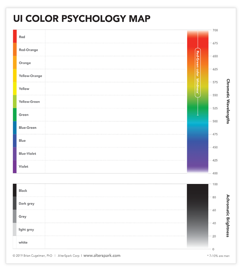
There are several studies that show a similar pattern, on the way that hue relates to the three emotional domains. We translated one of these studies to a visual color map (Figure 11), based on the data in Suk and Irtel (2008).
Pleasure and control peak in the cool colors, but drop in the hot colors. Conversely, arousal dips in the cool colors but peaks in the hot range, especially into red.

Figure 11. Hue in wavelength (perceived by cones)
Figure 12 shows the achromatic scale from black to white, with the three emotional domains. Overall, the positive, optimistic, and relaxed emotions lie closer to white and light grey, while the most depressing color is in the grey zone with higher arousal and stress-like emotions closer to black.

Figure 12. Achromatic (white to black perceived by rods)
When it comes to applications, I’ll discuss salience strategies later on. But for now, I’ll discuss how you can use this study to strengthen your emotional design strategies.
Stressed
Typically, I reserve red and the warm colors for stress inducers such as deadlines, major errors, or anytime you must arrest users’ attention. Similarly, you can use high-contrast black, which has the double advantage of being a highly arousing attention-grabbing design element that’s also safe for most visually impaired persons.
Optimistic
Green is the most optimistic color, with decent pleasure, arousal and control connotations. On the achromatic scale, as we enter light grey and white, we hit the highest ratings for these optimistic emotions, which may be why there are so many designers who opt for basic white and grey structures.
Relaxed
Cool blue is the least arousing, with the most pleasing and comforting emotions, so it could be a good choice for empowerment-focused design or co-associating your brand with competence. This is also a good color zone when your goal is to foster a sense of security and comfort.
Pessimistic
I’ve always wondered why people say things like “It’s so grey and depressing”. On the achromatic scale, the most depressing point with low emotions is middle grey. When it comes to colors, there isn’t any clear pessimistic emotion zone, so grey is our most depressing color that is technically not a color.